1
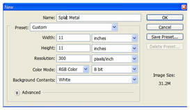 Create a new image with the following attributes:
- Width: 11 inches
- Height: 11 inches
- Resolution: 300 ppi, 8 or 16 bit
- Background Color: White
2
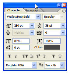 Since the desired effect is to appear liquefied, a font that appears to have been made with a crayon or round brush will work perfectly. Select the Type tool and open the Character palette from the Options bar. The font I’ve chosen is called ‘WallowHmkBold’… if you do not have this installed on your system just use the font of your choice. The attributes for the characters are seen below:
3
 Note that the color is gray in the #666666 range and NOT stark black.
Type a word across the face of the image.
4
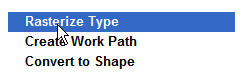
Rasterize the type layer, then paint a few additional gray dots around the type.

5
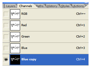 Open the Channels palette and duplicate a channel… the Blue channel will work fine. Go to Image>Adjustments>Invert.
6
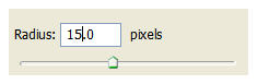 Open the Filter menu and select Blur>Gaussian Blur. First, blur the channel at a 25 pixel radius. Blur the channel again at a radius of 15 pixels.
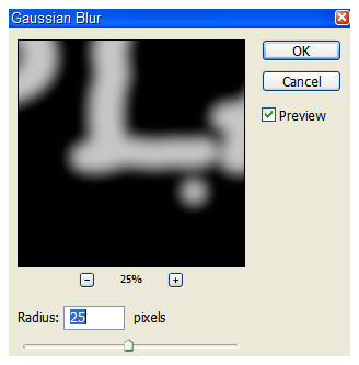
7
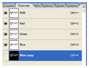 Turn off the Blue copy channel, but don’t delete it… you’ll need it in a moment or two.
8
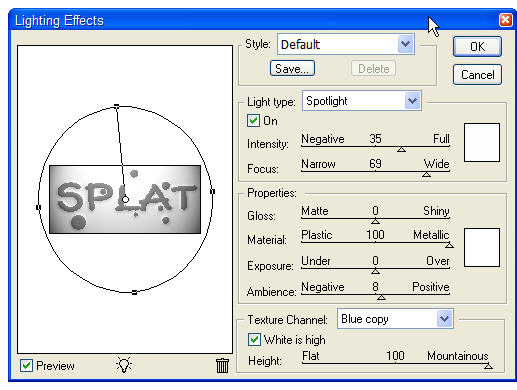 Go to Filter>Render>Lighting Effects. Set it up as outlined in the image below… be sure to select the Blue copy channel as the Texture Channel.
9
 The result of all that is a pretty basic bevel, and yes, you could do pretty much the same thing with a layer style. Some habits die hard, however, and I like the end result better when channels come into play. What can I say? I’ve been doing it this way since at least PS 6, and if it ain’t broke, don’t fix it!
10
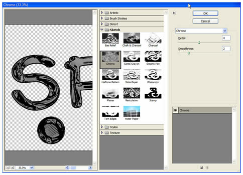 Duplicate the text layer and go to Filter>Sketch>Chrome. Set up the reflections as seen in the dialog box below:
11
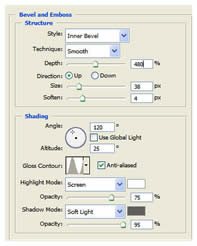
Now you can play with Layer Styles a bit. Open the Layer Styles dialog box and select Bevel/Emboss. Enter the following settings… note that the Shadow color is again gray in the #666666 range and not black. Once done click OK.
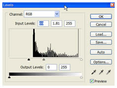
12
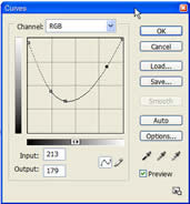
Let’s shine this up a bit. Command/Control+Click the text layer to generate a selection, then make a Curves adjustment layer and Levels adjustment layer with the settings seen here:
13
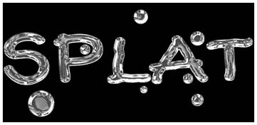
Against a black background the shine really comes out.
14
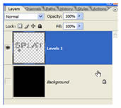 Turn off the background layer or layers (if you added the black separately) and merge all the others together.
15
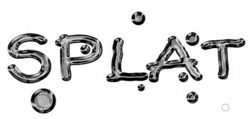
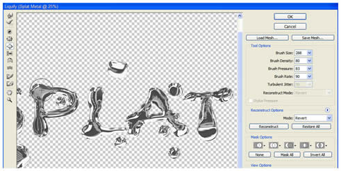 To give the type an enhanced liquid quality, go to Filter>Liquify. Use the Bloat tool to expand or otherwise warp areas of the text as seen here. Once you are happy with the distortions, click OK.
16
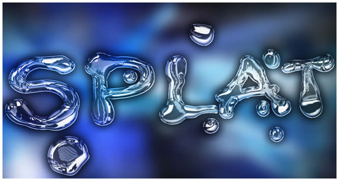
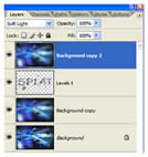 You can now throw the text into any image you so choose. In the following example, I’ve blurred a tech-style background, placed the type in that document, then placed a duplicate of the blurred layer above the text. The Blend mode of the top layer is changed to Soft Light to serve as reflections off the type, or making the type appear transparent allowing you to see the background through it. I’ll let you decide what is actually happening.
That’s it for now. Until next time, I’ll see you at ActionFx.com. Take care!

No comments:
Post a Comment